Tuesday, November 24, 2015

How Private is Your PII at Chipotle?

 Nowadays when on the Internet, it can be scary to give away private information. There are so many threats online from unauthorized parties accessing personally identifiable information (PII) to receiving unsolicited promotional material to identity theft. Due to these threats it is important for consumers to know what their information is being used for and how well the company protects it. 

Chipotle: How Safe Are You?

When accessing the Chipotle company website, you are able to view the company's privacy policy page. Here, the company discusses what they do in order to protect consumers and their PII. The company only collects personal information when it is voluntarily given to them by consumers. Their policy went on to describe other aspects that will be discussed below.

The California Do Not Track Notice 

The company does not track any PII on their site unless it is explicitly given to them by consumers. 

Mobile Terms and Conditions

  • Must be older than the age of 13 to use the program
  • Once signing up for the mobile text program and providing their number, the consumer is fully aware of receiving promotional texts
  • It is known that data and messaging rates may apply when using the program
  • Data obtained when using the service will only be data given away by the user

Cookies

The site uses cookies to remember visitors and make their experience when using the site better.  
Sharing of Personal Information
The company does not sell consumers' personal information to any outside sources unless for reasons discussed in the policy. Such as, if consumers grant permission. Also, if publishing submissions on the site, the company does not include the publisher's name or information.
In Regards to Children
The company does not intend for those under the age of thirteen to be accessing the website. 

You Can Opt In or Out at Any Time

Is it Enough?

 The company is doing a good job of informing consumers on what their information is being used for and informing them that their information will only be known if given. However, the site company could improve their protection of consumers' PII. First off, the company could ask those who submit posts if they can publish it to their site rather than doing so anonymously. Those looking to steal information could look up these posts and find the writer's information if they really wanted to do so. Also, the company could provide users of the site with a follow up email telling them what information has been given to them that they have access to after the user has provided their email to the company for any reason. All in all, Chipotle does a great job of informing customers that their information is used responsibly and that they strive to do their best to protect any PII. However, just as with all other companies, there is room for improvement in protecting the information from third parties finding it out.
Remember, Always be aware of information you provide to companies and whether or not it will be responsibly protected and used.  
 The following will discuss the analytics of my blog to date as this is the last blog post for my fall semester. 

Most Popular Post

On Blogger I was able to track the page views for each of my posts. The post that generated the most views was titled "Marketers: Take Advantage of the New IAB Guidelines, Not Consumers. In this post I discussed the new formats IAB had for advertisements. I believe this post gained the most views because of it's popularity on LinkedIn when my connections and those of my professor viewed it. According to Blogger the post had a total of 58 views. 

 Where My Traffic is Coming From

I was able to use Google Analytics to track where my traffic is coming from for my blog. Majority of my viewers come from Google Chrome, Safari, and Firefox browsers. Desktop users counted for most of my views. However, an Apple iPhone was the most popular device used to access my blog. This could be due to those on LinkedIn going to my blog from the app on their phone or because of the increase in cell phone use across the globe. Globally, I have viewers from a wide variety of countries including the United States, Russia, Japan, the UK, Netherlands, and so on. 

 How I Can Improve Engagement and Reach

In order to maintain my traffic I need to increase the reach of my blog. To do so, I should I post the link to my blog and posts on sites other than my Google+ and LinkedIn, but also on my Facebook, Twitter, and possibly even Instagram. To increase the engagement of my blog I could do two things. One, I could encourage readers to leave comments with their opinion on what I am discussing. Secondly, I could also encourage them to share my posts with their friends and social media connections if they enjoy my post and believe others would as well. 

Moving Forward

As I continue my blog, I will encourage readers to share and comment. I will also strive to have a post at least every two weeks, but I will aim for one every week. In the future, I will also expand the number of companies I blog about to attract a wider audience. Possibly, I will even use content that is more encouraging of interaction such as videos and other forms of rich media. I plan to keep blogging and see how I can improve and learn as I go along. 

Please feel free to comment if you have any other suggestions for how I can improve!  

 Roberts, M., & Zahay, D. (2013). Internet marketing: Integrating online and offline strategies (3rd ed.). Mason, OH: South-Western Cengage Learning.
 Chipotle. (n.d.). Retrieved November 24, 2015, from https://chipotle.com/privacy-policy
One account. All of Google. (n.d.). Retrieved November 24, 2015, from https://www.blogger.com/blogger.g?blogID=9183587198598570054#overviewstats/src=dashboard
(n.d.). Retrieved November 24, 2015, from https://analytics.google.com/analytics/web/#report/visitors-overview/a67191721w103757631p107910632/ 

Monday, November 16, 2015

Uber: The On Demand, Easy to Use Site & Mobile App

Nowadays it's generally easy to find a relevant website when you are looking for a product or service.  While finding the website is no problem, it can be difficult at times to navigate the site once found. Companies such as Uber, however, are making the customer experience easy by having easy to navigate and well designed websites and mobile apps available for users. 

The Website 

Web Design Principles

Uber has flawlessly designed their website by implementing good web design principles. For starters, the company's site has established the objectives of the company; the company's slogan"Your Ride, on Demand" is the first thing the viewer is drawn to. The site also identifies the target market they are attempting to reach being individuals in need of transportation quickly. The site content and navigation structure are clearly defined. Uber follows the golden design rule of staying "above the fold" by displaying the most important information in the upper half of the website. Here, they display the menu bar, a log in or sign up option, and a link for those interested in becoming a driver for the company. 

Web Design Tips

  • Other Web design tips the company follows:
    • Avoids videos that load automatically
    • Large fonts
    • White background 
    • Avoids flash 

The Mobile App

As if using Uber could get any easier, the company's app is by far the simplest website for users to navigate and is well designed. 
The app is easy to find on any mobile application store. Users are even able to download it straight off the company's website. Those interested in downloading the app can also find links to it on apps that are currently popular games through the company's advertisements on such apps. 
As shown above in the simple steps it takes to use the app, Uber is a very easy app to use. Users set their point of pickup and destination. From there, they can choose between an uberX, uberSELECT, or LUX. They are also given the option to decide on an uberX or uberXL depending on how many people they are riding with. Once they have made their selection a ride is requested and within minutes the driver is on the way or has already arrived. 

 The Customer Experience

The customer experience can be defined as how customers perceive all the interactions they have with a company or brand. From personal experience and that of my peers, I would give the company's customer service a high rating. The app and site have a feeling of connection between the riders and drivers. The physical appearance of the app also makes it easy for consumers to navigate and complete their desired task. The website and mobile app provide a help section for users to contact the company if any issues or concerns arise when sing the service. After each ride, riders are given the opportunity to rate their ride, driver, and provide he company with feedback on the experience. This can be used for the drivers and the company to provide superb customer experience by hearing real time feedback from application users.  


Room for Improvement

Though the design and ease of use that comes with the Uber app and website, no company can ever be perfect. Possibly, the company could implement breadcrumbs on their site. Breadcrumbs allow visitors to know where they are at all times through he use of a bar at the top of the page showing the path they followed in the site to reach their current location. Now that their site and app are up and running, the company should look into the use of testing to monitor their site and mobile performance. For the service company they are, I would recommend using customer feedback and usage statistics to see when and where improvement is needed.  
All in all, Uber has done a fantastic job at providing a great customer experience on their mobile app and website. Not to mention they provide a great service to consumers as well. The remainder of my posts will go into detail about my blog analytics so far which I receive from Google Analytics.

Google Analytics 

 So far, I have achieved 184 page views with an average session duration of 4:04 (I believe the decrease in time from when I last checked is due to a shorter post I just published). New users account for 50.8% of my traffic while returning visitors account for the remaining 49.2%. The average pages per session is 2.19. The interests of my readers range from movie lovers, TV lovers, technophiles, and business professionals. 

Where Is My Traffic Coming From?

  • Geographically:
    • United Sates (58.73%)
    • Russia (17.46%)
    • United Kingdom (6.35%)
    • Netherlands (3.17%)
    • United Arab Emirates (1.59%)
    • Australia (1.59%)
    • Bosnia & Herzegovina (1.59%)
    • Canada (1.59%) 
    • Czech Republic (1.59%)
    • Hungary (1.59%)
  • Readers are coming from a wide range of browsers including Google Chrome, Safari, Opera, Internet Explorer, Android Browser, Mozilla, and Firefox. 
  •  Mobile Overview:
    • Desktop (74.60%)
    • Mobile (23.81%)
    • Tablet (1.59%) 

How Can I Increase Traffic? 

I can increase traffic to my blog in multiple ways. First, I can create catchy and attention grabbing titles to draw in readers. Secondly, relative labels are important to optimize search results for my posts. Next, I can use my social media accounts to promote my blog like I have done on LinkedIn. Lastly, to increase the traffic to my blog I can ensure my content is rich and attractive to viewers to draw them into what I have to say about digital marketing. 
 (n.d.). Retrieved November 19, 2015, from https://www.uber.com/
 (n.d.). Retrieved November 19, 2015, from https://analytics.google.com/analytics/web/#report/visitors-overview/a67191721w103757631p107910632/ 

Saturday, November 14, 2015

Holiday Shopping: It's Like Christmas to Marketers

Each and every holiday season we see what seems to have become the true meaning of holidays: shopping. A dream come true for marketers.

Like every sane person during the holidays, I tend to enjoy keeping my holiday shopping down to one trip if possible to a place I can get a simple gift for everyone necessary. Preferably Target. I also avoid the mayhem that comes with Black Friday shopping at all costs; unless I am at work then it's impossible. However, even while trying to avoid the madhouse of stores during Christmas time, I still see the advertisements for the latest deals and sales.
In today's society it is inevitable to avoid these commercials. Whether it be for jewelry, toys, clothes, or cars marketers are always catching the attention of viewers during this season. While some commercials are a success, some are complete failures and are torture to watch. As an advertiser, you want to have an ad that's enjoyable to watch. Especially during " The Most Wonderful Time of the Year". Here's how to do please your viewers.

 1. Address the holidays without causing a controversy.

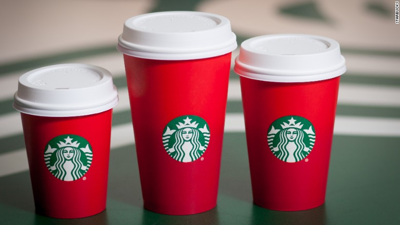
This holiday season, Starbucks gained negative publicity for their new holiday cups. Many Christians claimed the cups did not represent Christmas just because they were red. Marketers need to beware of becoming the next ones to upset consumers; especially during a time where consumer spending is at a high level. Address the season with relevant images and messages in products and ads to achieve the happiest of viewers and consumers. 
 

2. Incorporate the values of the holiday season.

Nothing says "holidays" like time with family and friends together. To achieve a more personal feeling in advertisements, marketers should incorporate the sense of togetherness in their ads.  In other words, place emphasis on the social part of the season, not the consumption part. 

3. Be festive.

The holidays are a time of love, cheer, and happiness. Positivity in  advertisements will be more successful at grabbing the attention of viewers than commercials meant to make viewers sad. So spread the cheer in your commercials and watch your sales increase! 

 There you have it, three quick tips for marketers to consider this holiday season to achieve maximum advertisement optimization. Happy holidays to all and happy advertising to all the marketers. 

Wednesday, November 11, 2015

Marketers: Take Advantage of the New IAB Guidelines, Not Consumers

The New IAB advertising formats are the right tools for marketers to use considering the direction advertising is moving.

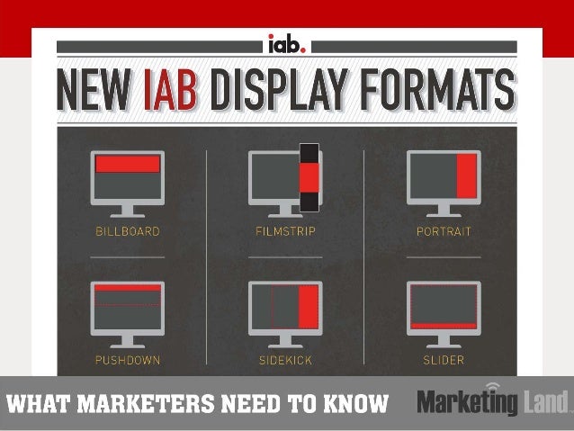
During the last two years, IAB rebuilt their ad portfolios in order for two-thirds of them to be interactive, new, and multiscreen. Advertisers are taking advantage of these new formats and heavily implementing them. Some users might not like the new formats making it harder to avoid seeing the advertisements, but marketers sure love them. You can view the complete list of these new styles for yourself here

So What Do Marketers Need to Know About These Formats?

If these statistics aren't convincing enough for advertisers to use these formats then I don't know what is. When trying to acquire customers you want interactivity, interaction, and viewing time; which the new portfolio provides for marketers. 

Who is Using Them?

While the main companies I have been discussing throughout my blog (Chipotle, Uber, and Snapchat) do not include advertising on their websites I decided to take a look at different sources to see who was implementing these formats. Instead I researched online online for articles discussing these companies. From there I looked to see what formats they were using online and then compared them to what ads were on the same site from a mobile device to see if they were the same or different. 

When researching Chipotle I found an interesting article on the company on the Huffington Post that included advertising. The site online included a banner advertisement for Goldman Sachs and two ads on the right side for Kohl's and GoDaddy that did not conform to the IAB guidelines. The Goldman Sachs ad was the most effective grabbing he viewer's attention by being colorful and located at the top of the page. I also included an interactive portion that if clicked, sent you to a link to watch a video on how the company is helping the Brooklyn Navy Yard grow. The Kohl's and GoDaddy ads blended in too much with the recommended articles on the side and were not interactive or attention grabbing.

When viewed on my mobile device, the ads were different. There was a banner ad on the top as well, for Hillary Clinton's campaign, which is not listed under the mobile formats on the IAB website. However, there was an adhesion banner for comfortable retirement that followed the guidelines.  The ads were both effective in grabbing my attention because of their size and placement on the mobile site. Through using the adhesion banner to promote comfortable retirement, Fisher Investment took advantage of using one of the mobile rising star advertisements.
When viewing a Forbes article on Snapchat, I noticed the effective use of advertisements on the site immediately. When the page first loaded there was a full screen video ad for Gap International as included in the IAB formats. The ad was highly effective considering it took up majority of the screen. Next, there were sidekick ads for Uber, GoDaddy, Google Fiber, and Le Cordon Bleu all effective as well through their rich media and use of color and movement. 

 When I viewed the same article on my phone I noticed the difference in ads. There were two adhesion banners, one for IBM and one from Lyft. Again, effective use of the mobile rising star formats by marketers. The ad for Lyft caught my attention more than the IBM one considering I am a frequent customer and do not search or use IBM on a regular basis. 
To see how companies who discuss Uber use these ad formats I visited the yelp page for Uber. On it, there were two sidekick ads for the companies Toyota and the American Red Cross. Both ads were effective with their placement towards the top of the screen. I didn't ave to scroll down much to view them. Also, they implemented the new IAB guidelines in their advertisements. 
 

However, when I viewed the page on my phone there were no ads. Bad for marketers, but good for readers who are not interested in advertisements

If Chipotle, Uber, and Snapchat want to become effective websites for advertisers in the future they should personally take advantage of these new formats to implement online video advertising.  

Chipotle

With Chipotle having very creative YouTube videos it would be effective for the company to advertise these on websites to spread their brand message. Most people know of the brand but do not realize that the message of the company is sustainability. By advertising their videos promoting this message, consumers would be aware of the brand's mission to provide a healthy, sustainable meal in a sustainable manner. Given that their videos are so captivating using the fullscreen format would be the most effective ad format for them to use.

Uber

For Uber being such a fast growing company that so many individuals can benefit from, advertising their brand in an interactive and fun way, such as through video, would help the company. Many consumers are unaware of the other services the company provides such as food delivery in some locations and on special occasions they will even deliver cats to be played with for a couple hours. Advertising these perks they provide by emphasizing their delivery and ride services would most likely increase usage and interest in the brand. Using a filmstrip image approach to show these services and a time sync ad format would be most effective to tie them all in together. 

Snapchat

With Snapchat being an app that allows users to send images and videos to each other it would only make sense for the company to implement this media in their advertisements. One way to use the fullscreen format would be to include videos of users snapchatting and having it appear as though they are actauly snapchatting those viewing the ad. Viewers could then have an option to open the snap which would lead to the company's site or be able to download the app instantly if using a mobile device. Fullscreen approach in video advertising would also tie in with the fullscreen image and videos when using the app. 

So, if you're a marketer for a company, take advantage of these new guidelines! Not because you should, but because of their effectiveness and engagement and interaction they provide for consumers. You're brand and sales will thank you.
(n.d.). Retrieved November 12, 2015, from http://www.iab.com/wp-content/uploads/2015/10/IAB_Ad_Unit_Poster.pdf
Luling, T. (n.d.). 15 Things You Didn't Know About Chipotle. Retrieved November 12, 2015, from http://www.huffingtonpost.com/2014/01/28/chipotle-things-you-know_n_4658711.html 
 (n.d.). Retrieved November 12, 2015, from http://www.forbes.com/sites/jjcolao/2014/01/06/the-inside-story-of-snapchat-the-worlds-hottest-app-or-a-3-billion-disappearing-act/
(n.d.). Retrieved November 12, 2015, from http://www.yelp.com/biz/ubhttp://www.yelp.com/biz/uber-austin-5er-austin-5